We’re passionate about the power of branding. We understand that a strong brand identity is the cornerstone of any successful business. But what happens when a brand decides to shake things up, to reinvent itself with a bold, sometimes controversial, rebrand?
Rebranding is a delicate dance. It’s about staying relevant, attracting new audiences, and reflecting evolving values. But it’s also about respecting the brand’s heritage and not alienating loyal customers. Sometimes, this tightrope walk leads to a spectacular success, and other times, it sparks a firestorm of debate.
Recent Controversial Rebrands That Got People Talking:
Let’s take a look at some recent rebrands that have stirred up a bit of controversy:
Jaguar
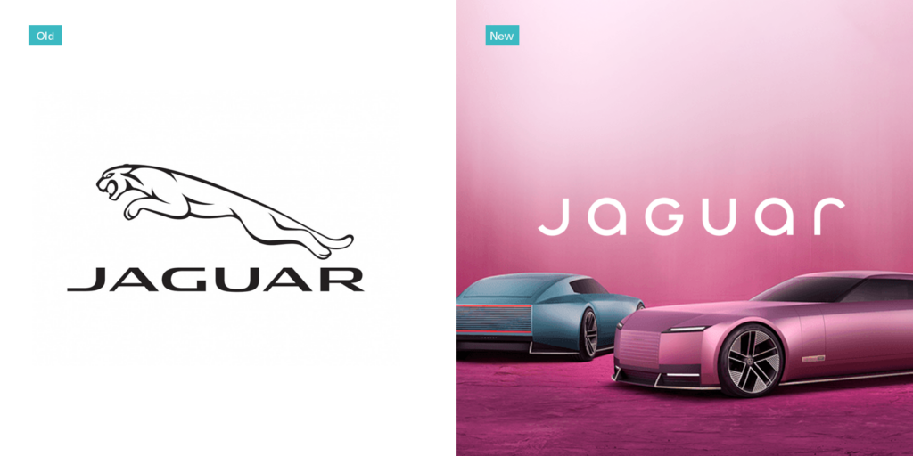
The iconic leaping jaguar emblem, a symbol of elegance and power, has seen a more minimalist and, some would say, less emotive redesign. The change has drawn criticism from those who feel it lacks the classic sophistication of the original. The shift towards a more modern, streamlined look reflects Jaguar’s push towards electric vehicles and a younger demographic, but has it alienated its traditional customer base? Only time will tell.
PrettyLittleThing
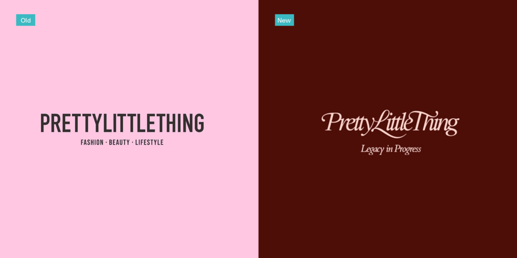
This fast-fashion giant has faced criticism for its rebrand, with some arguing that the new aesthetic feels generic and lacks the distinctive edge of its previous identity. The brand’s attempts to elevate its image have been met with mixed reactions, with some questioning the authenticity of its new direction. In a market that changes quickly, Pretty Little Thing must find the balance between staying on trend, and not becoming a faceless brand.
Kia
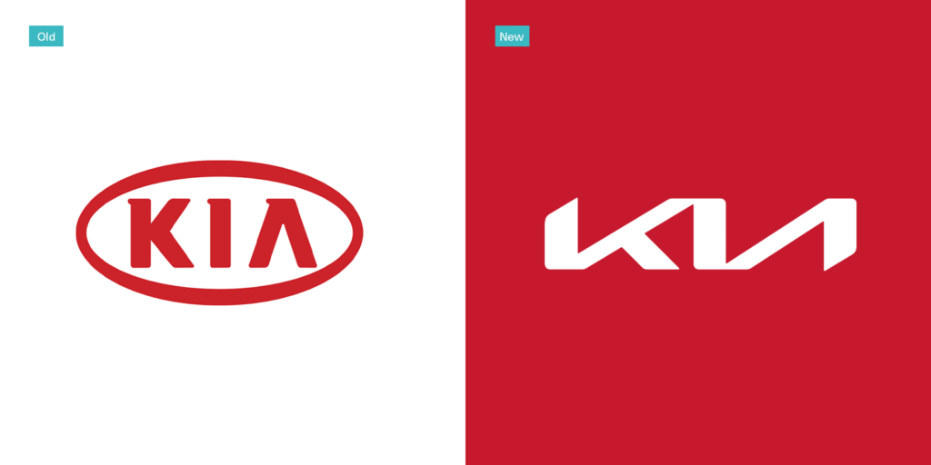
Kia’s new logo, while modern, was so stylized that many initially misread it as “KN.” This confusion highlights the importance of legibility in logo design.
Weight Watchers (WW)
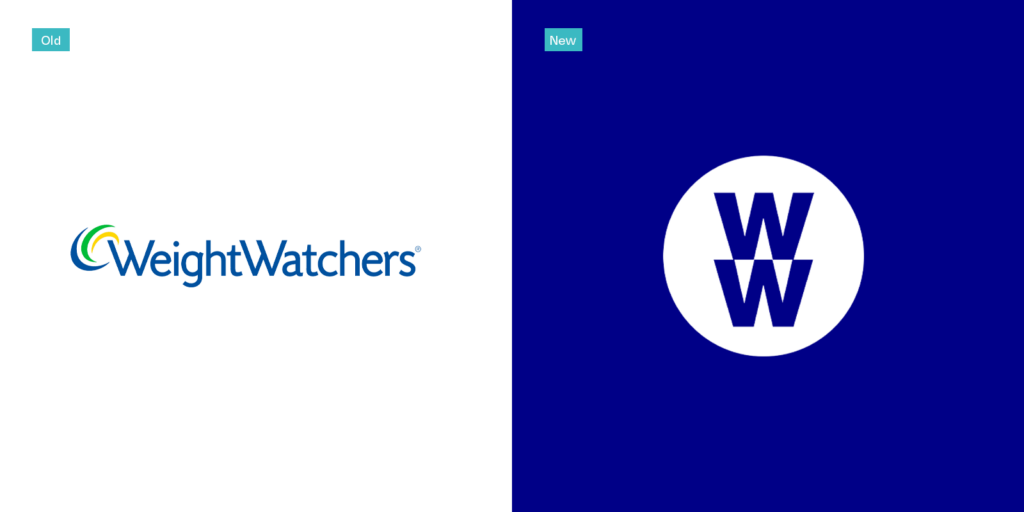
The rebrand to “WW” was intended to signal a shift from weight loss to overall wellness. However, some felt the new name was too vague and lost the brand’s core identity.
Rolls Royce
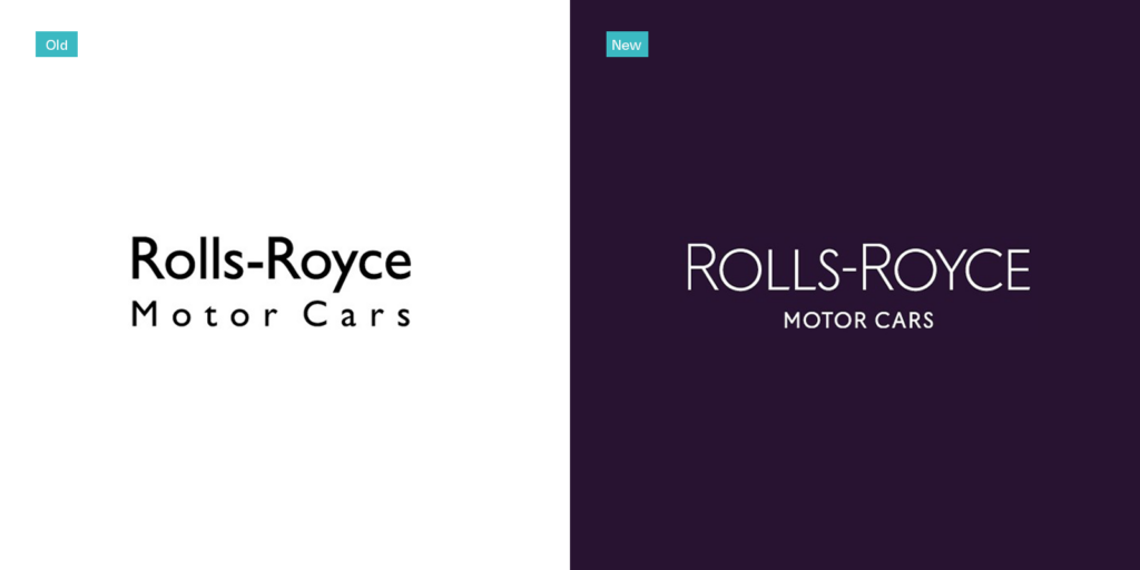
In a move to modernise the brand and appeal to a younger demographic, Rolls Royce announced a new brand identity. The new visual language, developed by Pentagram, gives increased prominence to the Spirit of Ecstasy, with an evolved illustration for the virtual world. The brand introduced a new signature color, Purple Spirit, complemented by a metallic Rose Gold. The wordmark has been refined, and a new typeface, Riviera Nights, has been chosen.
The Lessons for Businesses:
These examples highlight the importance of careful planning and execution when undertaking a rebrand. Here are a few key takeaways:
- Understand your target audience: Thorough market research is essential to ensure that your rebrand resonates with your intended audience.
- Communicate the rationale behind the change: Clearly explain the reasons for the rebrand and how it aligns with your brand’s overall strategy.
- Balance innovation with tradition: Respect your brand’s heritage while embracing new ideas and trends.
- Gather feedback and be prepared to adapt: Monitor public reaction to your rebrand and be willing to make adjustments as needed.
- Don’t change for the sake of change: There needs to be a valid, business-based reason for your rebrand.
Let’s Talk!
Have you experienced a controversial rebrand firsthand? What are your thoughts on the Jaguar, PrettyLittleThing, Kia, WW, and Rolls Royce rebrands? Share your thoughts! And if you’re considering a rebrand for your business, get in touch with Jigsaw Media today. We’re your local Dundee agency, ready to bring your vision to life.
